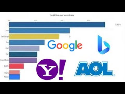
This graphic visualization shows the ranking of the most used search engines worldwide, highlighting their evolution over the years. Thanks to the use of a bar chart race, you can see in real-time how the positions of the various search engines change based on their popularity over time.
The video starts by showing the early search engines like AltaVista and Yahoo, which were once the industry leaders. But then, with the advent of Google and the introduction of an increasingly sophisticated search algorithm, the search engine landscape changed dramatically. As time goes by, Google becomes more and more popular and gains an increasingly dominant position in the search engine market.
In the video, trends in search engine usage are also shown based on countries and geographical regions. For example, some countries may have different preferences than others and this can influence the positioning of search engines on the chart.
Watching the video, you can dynamically observe the performance of the major search engines over the years and notice their different phases of growth and decline. By the end of the video, you will have a better understanding of which search engine is the most used in the world and how user preferences have changed over time.
Thank you and good viewing
Numbers, Stats and Curiosity
music: “Wanderlust” by Scott Buckley
https://www.scottbuckley.com.au
#searchengines
#google
#bing
#altavista
#yahoo
#internetsearch
#onlinetrends
#infographic
#dataviz
#visualization
#bigdata
#technews
#digitalmarketing
#seo
#searchengineoptimization
#top10 #most #popular #alltime #stats #curiosity #top
source


