‘If winter comes, can spring be far behind? ‘
The beauty of the spring season is such that it enraptures poets, dancers, singers, the most frugal of shoppers, and ,thus, last but not the least, even marketers!
‘Tis the time to usher in fresh perspectives and awesome offers and showcase that nonpareil collection, and there is no better way to flaunt your spring repertoire than to belt out some well-worded and creative spring emails.
Ideas abound with summer holidays in the offing, and holidays are aplenty, which means people will be looking out for incredible new apparel, summer essentials, hiking gear, hats, and sunscreens and will, in general, be in a mood to go out and about.
With the frangipanis and semul in full bloom, people will also experience an inherent desire to clean out chock-full wardrobes and make space for their new spring and summer collection. If you are into the apparel and home essentials segment, this could be your Christmas. Make the most of it!
Need some inspiration?! Well, you are at the right place, amigos! Check out some email-inspo from brands in our inbox who have nailed their email game, and maybe next time, we will feature yours in our spring email list!
1. Animoto’s Spring Video Calendar:

Animoto is a drag-and-drop video-making tool, and we love their April video content list of ideas! Fresh, quirky, and out-of-the-box, here’s what we can take away from their super cool emailer;
- The Visuals: The aesthetics are clean, easy on the eye, fresh, and appealing! The zesty summery blues and peachy vibes towards the end of the mailer give an overall beach vibe to the whole experience.
- The Content: They have picked up and earmarked fun days, Easter, and days for expressing gratitude in the month of April as something the receivers can consider making videos on. The mindful use of emojis, interlinking on key phrases, and concise, expressive yet compelling sentences and phrases are a deal-sealer for us!
- Placement of CTAs: The placement of CTAs (Make a Video) at the beginning and towards the end of the emailer is a smart move. The reader reads, gains inspiration, and proceeds to make a video, which means greater website hits and, hopefully, conversions!
PS: The gift toward the end is the link to their blog in case viewers are looking for more video inspiration! Awesome move, we say!
2 .The Loom’s Spring Discount Emailer:

The Loom is equipollent with aesthetic, eclectic, traditional garments and accessories, and their spring emailer resonates with the brand ethos and values.
Let’s check out every element that passed the vibe check!
- The Aesthetics: The visuals are ineffably springy, full of pastel tones, lemony zest, and verdant greens, so appealing that your inner fashionista wants to grab a dress right away!
- The Content: The content is sparse yet effectively placed.The time-limited sale adds the FOMO element.
- The CTAs: The Shop Now CTA is placed strategically next to a beautiful dress; the user sees, likes, buys and yes they nailed it! The extra INR 2000 cashback provides the extra impetus to make that impulse purchase.
3. Graza’s Olive Oil Advert To Stock Up on Spring Salad Dressings!

This beauty of an emailer caught our attention and had us daydreaming about that perfect Caesar salad. This email has everything that goes well for its intended audience (all those who like to eat good stuff!)
- The Visuals: The olive green and the interplay of yellow tints are a beautiful and youthful representation of the brand’s product and the spirit of spring. The lemony mojito makes you crave for a delectable spread to go along with it. Teases all your senses! This email serves as a fine example of how one can use design to evoke the sentiments of a particular occasion.
- The Content: Quirky, springy, and does the job well, what more could one ask for?! This is one email that not many would opt out of.
- The CTAs: Placed right under the line that goes you can pair this with almost everything, you are tempted to get your own bottle of extra virgin, squeezable olive oil. Sparkly, and sprightly we say.
4. Everlywell’s Spring Wellness Checklist Preview Mailer:
Everlywell offers health and wellness at-home solutions and their spring email does not disappoint. With the change in season, a whole host of allergies crop up and it is always wise to keep tabs on one’s health status. Everlywell’s spring checklist wins on different levels, here’s what we loved.
- The Aesthetics: In tandem with the brand’s color palette, the visuals accentuate the message which is to encourage subscribers to get proactive about their health status.
- The Content: Concise, crisp, and effective. The spring offers add the icing on the cake!
- The CTAs: Creatively and cleverly placed, they will translate into website hits and conversions!

5. Magic Spoon’s Cereal Spring Inspiration:

Magic Spoon’s spring emailer almost had us grabbing our cereal bowl and spoon! It’s that fresh, effervescent, and may we dare to say, tasty! Here’s what you may choose to take away from this beautiful email;
- The Visuals: A complete package of lovely colors and smart layout, they have creatively made us dig into our proverbial cereal bowls. Another interesting observation is the color coordination with the fruit in question, the tints of reddish pink in the berry bundle, and the yellowish tint in the peaches and cream section has us hollering for more delights!
- The Content: The headline, the intro and the product selection, everything is so beautifully done that you’d probably be sharing your CVV numbers whilst reading this blog. Now who wouldn’t like a boxful of spring delights served fresh with full-cream milk?
- The CTAs: The choice to make your own bundle of cereal delights- now who would say no to that invitation? A CTA-hall-of-fame entry for sure.
6. Cuisinart Spring Appliance Sale Email:

When it comes to cookware, you can never have enough for it, and the spring season brings with it a desire to spruce up the home and the hearth. Cuisinart capitalizes on the dominant customer sentiment and has come up with a spring sale on its product range. Their email does justice to the same with clean aesthetics, single-column layout, and strategically placed CTAs.
7. Puma’s Spring Apparel Collection Email:

Puma’s season arrival collection email is a neat reminder to stock up on your spring essentials. The color palette is easy on the eye and the focus is on the apparel and accessories. The youthful and vibrant aesthetics add the cherry on the cake. The personalized recommendations and picks for kicks in the second half of the email add the extra zing. The store locator and link to socials complete the look of the perfect, professional email.
8. Fitvinewine’s Flavorful Collection of Fine Wine’s Spring Delights:


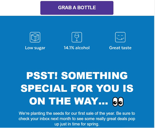
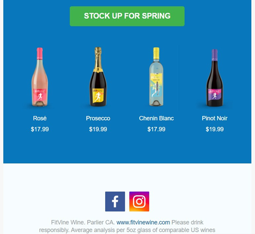
When spring comes, your minibar calls for an uphaul too! And that’s exactly what this spring email from Fitvinewine is all about! Whilst offering a sneak peek of what’s in the offing they also hint at some cool deals. Whether you prefer Pinot Noir or a sweet rose-flavored wine, the tantalizing collection stirs up the oenophile in most of us! With appealing visuals and emojis, the CTA is placed right above the wine creatives and the first one on top of the email does the job exceedingly well.
Summary
Seasonal emails have been known to generate greater revenues than traditional emails. The reasons are manifold, right from being theme based to capitalizing on different sentiments across the year. During Christmas, for instance, winter collections, tree decorations, and bakery products see an uptick while during spring and summer, people in general have a buoyant attitude towards life in general- that is when you step in with the awesomeness you have on offer! Need help writing and coding awesome email campaigns? Drop us a DM! Spring or summer, we’d love to hear from you.


