Emails with a wall of text would hardly impress the subscribers. Fortunately, we don’t have to deal with such boring emails with the advent of visual email marketing and trends like interactivity, gamification, and AMP emails taking the center stage.
In 2023, we are all set to welcome some new trends in the email design arena.
Let’s delve deeper and get inspired for our next year’s emails.
1. Use of stylish visuals
i. A combination of shapes, illustrations, and real images
Using an assortment of shapes, illustrations, and real images will give a fresh feel to your emails. In 2023, marketers will adopt this trend to make their emails stand out and prompt the subscribers to purchase.
ii. White space
Use enough white space to make the emails easy to scan. They break down the email copy and enhance its readability. A cluttered email will turn the subscribers off. So, it is advisable to incorporate breathing space for the readers.
White space can be placed in two ways.
a. Active white space: Negative space surrounding the important email elements
b. Passive white space: Negative space at the template borders and the area between different sections
2. Shapes to make the emails more meaningful
Square, rectangle, triangle, circle, and polygons — all these shapes can be used to convey different messages in emails. While squares and rectangles convey trust, stability, and grounded nature, triangles represent movement and progression. Circles and ovals portray comfort, warmth, and familiarity with their rounded curves. Pentagons, hexagons, and octagons can be used in patterns to reflect rigor, quality, and hard work. Their sides are used to show a long procedure in a simple manner.
Some brands like Tattly also use abstract shapes to make the emails more fun for the subscribers. Take a look at this email template below.
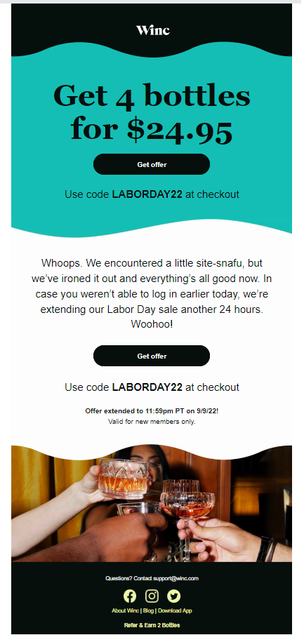
You can also use wave patterns to separate the different email sections. These patterns break the grid format of the emails and provide directional cues to scroll till the end. They make it easier for the readers to follow the email and draw attention to the crucial email elements.
Here’s an example by Winc. See how the usage of waves facilitates communication with the readers.

3. Neon colors to exude exuberance
Creating bright, vibrant emails will trend in 2023, which will contribute to the popularity of neon colors. Neon colors give a happy feel to the emails and paint you as a fun, youthful brand. Just bear in mind 3 points for effective usage of neons.
- Neons should be used judiciously and only when you have to highlight vital parts of the email.
- Dark backgrounds are better to make the neon colors stand out.
- Neon colors are best avoided in the background.
4. Gradients
When a single color goes from light to dark or vice versa, it is known as single color gradient. Similarly, when one color goes to another, it is known as multiple color gradients. Using gradients in emails aids to the visual hierarchy and compels the subscriber to read till the end.
You can use subtle or bold gradients according to your business personality. Alternatively, you can use gradients as the focal point of your email design or background. Some brands also use animated gradients in the background to add more visual oomph to the emails.
Take a look at this email by Oura Ring that used an animated gradient background.

5. APNG
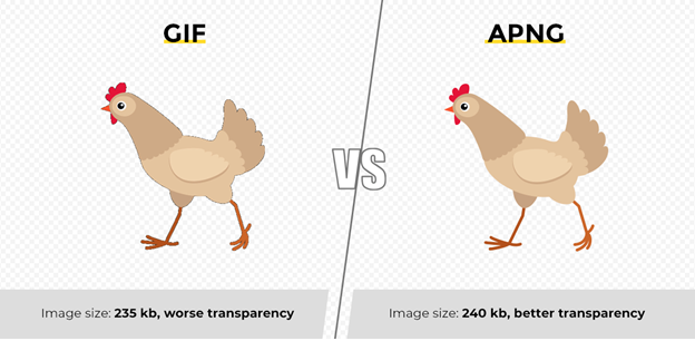
APNG is a type of animated image, just like GIF. However, APNG has a better resolution than GIF. It supports 8-bit alpha transparency and 24-bit colors. Unlike GIFs, APNG images won’t have an ugly black border in the animation.
Take a look at this image to understand how GIFs are different from APNGs.

6. Animated CTAs to draw the reader’s attention
Correct placement, actionable copy, and right colors that stand out — all these are the best practices when it comes to high-converting CTA buttons. In 2023, animated CTAs will make a glorious entry in the world of emails. You can animate the CTA by using GIF or CSS animation.
The marketers at Magic Spoon are early adopters of this trend and use it brilliantly in their emails.
7. Memes to add humor in emails
Memes have entered social media marketing long ago. Marketers are expected to use them even in emails in the times to come.
You must bear in mind 3 points while using memes:
- Memes are effective only when they are relevant to current events.
- Always add the copyright and disclaimer so that you don’t have to face any legal soup.
- Make sure it does not come off as inappropriate or offensive for the readers.
Wrapping Up
Good email design separates the grain from the chaff. It drives better email engagement and helps achieve the expected ROI. Stay abreast with these email design trends we foresee in the days to come and start designing emails that make heads turn.


