One of the first things your website needs to do is give visitors a great reason for becoming a customer.
As soon as a fresh pair of eyeballs lands on your site’s homepage, they need to know what it is you can do for them. And on top of that, they need to know why you’re different from your competitors.
In this article, I’m going to share with you some of my favorite web design tips for explaining your value proposition in a clear and compelling way.
Let’s get started.
1. Nail the Copy
Right, so this isn’t really a design tip, but it’s so important I’m going to lead with it anyway.
Your value proposition is the key to your website’s effectiveness. You’ll rely on it to convince people that they should buy from you instead of someone else. It needs to clearly communicate why they should do business with you in a matter of seconds, if not less.
Bear this in mind when you’re writing it. In no more than 10-15 words, you need to tell visitors what you do and why they should care.
A good value proposition should be unique to your business but also recognizable to your audience. At a glance, customers need to know whether or not they found the right site for the issue they’re trying to solve.
Take a look at the words that Tommie Copper uses in their homepage header carousel. Every frame in this element leads with a message that tells visitors that they’re about to browse products that lead the industry in pain relief.
2. Don’t Lose Your Core Message
It’s super tempting to cram as much visual information as possible in your homepage header. Don’t fall into this trap.
Imagery is fine. Even moving pictures are great to set the tone if they tell a story, but be careful not to bury your value proposition in such an elaborate design that users have trouble noticing or understanding it.
Remember that nothing in your site’s hero header is more important than your value proposition text. Everything else exists to support the message you’re trying to convey.
Other elements in your header need to synergize with your value proposition rather than steal attention from it.
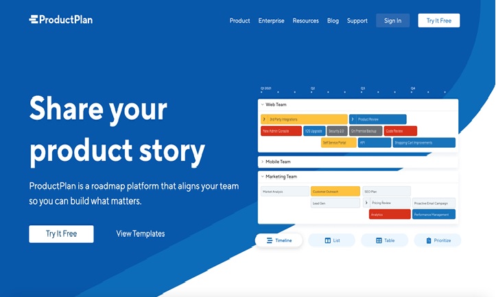
A good example of this tip in action is ProductPlan. The roadmap design tool manages to keep the user’s eyes focused on their unique selling point, despite using some relatively complex visuals in their homepage header.

The key to successfully doing this is creating a clear visual separation between the header’s “written” and “graphic” sections.
3. Communicate Value Using Your Product’s Core Functionality
Many online service providers insert a key user interaction point into the area where they communicate their value proposition.
This is an excellent way of combining a “what we do” message with “how we do it.”
While this approach may not be ideal for all digital businesses, it’s great for companies that offer a product that requires user input to get started.
BlaBlaCar is the perfect example of such a product. If you’ve never used the ride-sharing app before, it really helps you understand what they’re offering when the first things you see are fields labeled “Leaving from,” “Going to,” “Date,” and “Number of passengers.”
Instantly, a new visitor knows what the site offers and what it could mean for them.
4. Use Meaningful Graphics
Some websites use header graphics to evoke emotion. Other sites use graphics that communicate a message.
While both of these approaches can help establish your value proposition, it’s the latter that’s most effective at doing so.
An image that contributes in a meaningful way to your value proposition is one that is a great visual representation of your message.
It’s one that takes the concept you’re trying to convey and presents it using visual language.
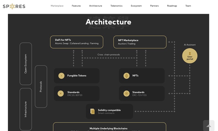
Take a look at how Spores approaches communicating their value proposition graphically. The NFT marketplace has relatively complex selling points, but the accompanying digital illustration makes understanding them much easier.

Reachdesk does an equally awesome job of communicating its unique selling points graphically. The marketing automation company uses a simple animation to show visitors what their product is all about: expediting e-commerce transactions.
5. Show Your Product in Action
This is an especially effective way to communicate your value proposition if you sell a type of product that your target audience may not be familiar with.
What better way to communicate what you are all about than showing your prospective customers an image or a video of your product in action?
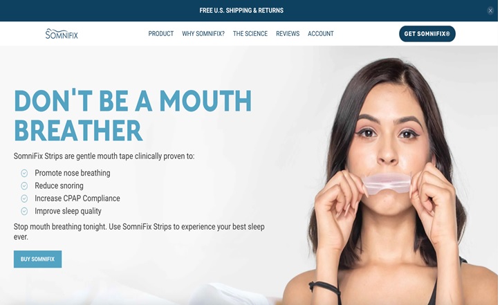
Take Somnifix as an example. The sleep-aid retailer sells a product that a large section of their target market may not even know exists. People that land on their homepage may just be aware that they have sleeping problems and that they need help.
There’s simply no way to describe what a product like theirs is about in under 15 words.
That’s why the site owners decided to include an image of a person applying the strips to their mouth in the header image, right next to the value proposition copy.

As the shopper continues to browse the site, they’ll learn not only what the product can do for them but also how it is used.
Some Final Thoughts
Few of your website’s visual assets are as important as your value proposition.
It’s the element of your homepage that is most directly responsible for ensuring that your visitors are able to quickly understand what you’re all about.
Along with being expertly written, it needs to be well designed in order to do its job effectively.
In today’s post, I’ve shown you five tactics you can use to drive this point home. Don’t overlook the importance of this section on your website.
To make sure that you deliver something meaningful here, design four or five options and test them out. Don’t be afraid to ask your peers or even prospective customers what they think about each iteration.
This is not an area of your site’s design that you want to gloss over. The stakes are simply too high. Give your value proposition the attention it deserves.


