Updated June 7, 2022
A style guide isn’t the most exciting content to create, but it’s one of the most essential for the success of your content. It can provide clear, universal guidance to thwart brand fails that come from inconsistency or miscommunication among your content team.
#Branding fails happen because of a lack of a clear style guide, says @SashaLaFerte via @CMIContent. Click To Tweet
A style guide also can be a way to foster content authenticity – containing instructions for all parties creating content for your company.
This article addresses why your organization needs a style guide, details what to include in your style guide, and gives examples of top-notch style guides to ensure streamlined external communications.
Why you need a style guide
First, what is a brand style guide?
A brand style guide is a holistic set of standards that defines your company’s branding. It references grammar, tone, logo usage, colors, visuals, word usage, point of view, and more.
A brand style guide references grammar, tone, logo usage, colors, visuals, point of view, says @SashaLaFerte via @CMIContent. Click To Tweet
By creating a detailed brand style guide, you ensure the published content is consistent, polished, recognizable, and more enjoyable. A thorough, well-thought style guide puts your audience first. It creates a recognizable, engaging voice and personality with which readers can form a more personal connection.
What to include in your style guide
GatherContent recommends that a style guide be between four and five pages. Anything longer is too much to digest. Create a style guide based on what resonates with who your audience is and what they want.
Keep style guide to no more than 4 or 5 pages, according to @GatherContent. @SashaLaFerte via @CMIContent. Click To Tweet
If you have a mission statement or boilerplate about us description for your brand, start there. Revisit it to make sure it’s not only on point with what it says but how it says it. If you define your brand voice as conversational, but your mission statement is filled with corporate jargon, it’s probably worth revisiting.
From there, create a table of contents for your style guide and use it as an outline. All style guides should include an introduction. This might include a mission statement, letter from the CEO, about us page, or general overview of the company’s brand and audience. Next, create a section on how your brand talks and writes and another section on branded visuals. Here’s a breakdown of what these sections should include.
Writing section
A brand’s image often can be attributed to what it says and how it says it. Details like whether to use “&” or “and” or the numerical or written versions of numbers may seem trivial. But the sum of these details adds up. If they are consistent throughout your brand’s published work, they convey the same voice, coherent thinking, and credibility impossible to attain without this consistency.
Here are some tips for ensuring that your brand guide aids in creating first-rate content:
- Baseline guide: Use an existing style guide (like AP Style) as the base. Add your brand’s differences, such as the use of the Oxford comma or general best practices for emojis.
- Formatting: Add a small section around formatting. Include details on how to use bullets, lists, hyphens, and quotes.
- Tone and voice: Describe these qualities and give examples of right and/or wrong tone and voice. If you want a playful tone, explain what that means. This section also should include information on sentence structure. Do you want long, complex sentence structures, a mix, or Hemingway simplicity? (Pro tip: Don’t use long sentences if you want to be persuasive.)
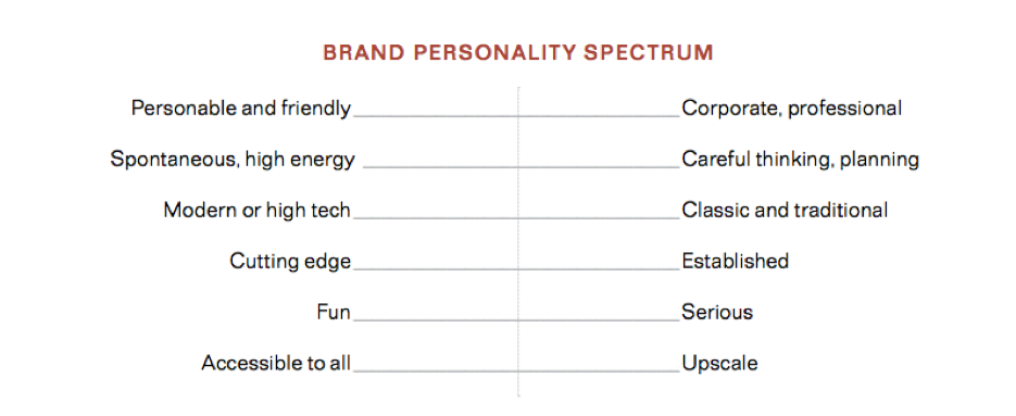
- Additional details: Include a section on how to engage, words to avoid, and any other details important to your brand. Use the brand personality spectrum below to get a better idea of what’s important to your brand’s written content.
In your brand style guide, give descriptions and examples of tone and voice, says @SashaLaferte via @CMIContent. Click To Tweet

HANDPICKED RELATED CONTENT:
Visual section
Visual cues are as important to brand consistency as the written aspects. Consider these elements for your style guide’s visual section:
- Formats: Include information on how to stay on brand with other formats of content, including infographics, video, motion graphics, etc.
- Colors: Detail your brand’s palette of colors, including function. Make sure to include each color’s hex, CMYK, and RGB codes, as well as Pantone number.
- Logo: Include all versions of your logo and examples of proper uses. If you have older or frequently misused versions, include them as “don’t-use” examples.
- Fonts: List all brand fonts for headings, paragraphs, etc., and their uses.
- Presentation format: Include a link to a company slideshow template for presentations.
HANDPICKED RELATED CONTENT:
2 brands with awesome style guides
Here are two brands we all know that have first-class style guides and highlights on what makes them special.
MailChimp
MailChimp’s style guide thoroughly prepares any contributor to create on-brand content. Check it out if you’re looking to create a guide with a lot of detail. MailChimp also breaks out writing guidelines by content type, from emails to blog posts to social media.
At Mailchimp, we’ve walked in our customers’ shoes, and we know marketing technology is a minefield of confusing terminology. That’s why we speak like the experienced and compassionate business partner we wish we’d had way back when.
We treat every hopeful brand seriously. We want to educate people without patronizing or confusing them.
Using offbeat humor and a conversational voice, we play with language to bring joy to their work. We prefer the subtle over the noisy, the wry over the farcical. We don’t take ourselves too seriously.
Whether people know what they need from us or don’t know the first thing about marketing, every word we say informs and encourages. We impart our expertise with clarity, empathy, and wit.
Highlights include the word list and voice and tone sections. Their voice section begins with a succinct paragraph: “At Mailchimp, we’ve walked in our customers’ shoes, and we know marketing technology is a minefield of confusing terminology. That’s why we speak like the experienced and compassionate business partner we wish we’d had way back when.”
@Mailchimp’s style guide prepares any contributor to create on-brand #content, says @SashaLaferte via @CMIContent. #Contentmarketing #Examples Click To Tweet
Uber
Though Uber recently moved its style guide to a protected site, its former publicly shared guide is a helpful example. It’s packed with GIFs and videos that convey the very movement Uber is so proud of. Uber uses this site to not only describe brand style but to share the brand story, showcase examples of its branding done well, and provide helpful tools. (The image below with the big, bold text reflects Uber’s style – “A bold new brand awaits.”
@Uber’s brand style guide is packed with GIFs and videos that convey the very movement Uber is so proud of, says @SashaLaferte via @CMIContent. #Contentmarketing #Examples Click To Tweet

According to Uber, the guidelines cover nine elements: logo, color, composition, iconography, illustration, motion, photography, tone of voice, and typography. The style guide’s home page also makes it convenient for users by highlighting and linking the most frequently requested assets:

Create your brand’s style guide
Now you know why a good style guide is important, what it should look like, and what to include. It’s time to create one for your company. Include the marketing team, sales team, and any other creatives working on your marketing and products when creating a style guide. Upon completion, share it companywide, and store it as a living document in an easy-to-find place.
Cover image by Joseph Kalinowski/Content Marketing Institute


