No two social media posts should be the same.
There’s a good reason for that – no two social media platforms are the same.
While ‘connecting and sharing with people’ lies at the core of every platform, each one is unique in many ways – Twitter is for updates, Facebook is for keeping in touch with friends and family, and LinkedIn is for making contacts and maintaining one’s professional image.
When you create posts for these platforms, you must keep in mind the following things that are unique to the platform:
- Type of audience which uses the platform
- The character limit for posts
- Best times to publish the post
- Ideal size for any images or videos
It’s important for you to take these nuances into consideration while crafting posts.
Advantages of Customizing Posts for Different Social Media Platforms
Let’s say you crafted a post for Twitter and then shared the same post on Facebook. You’ll see a considerable difference in the engagement you receive on both platforms.
That’s because people engage on these two platforms in different ways.
Facebook, Twitter, and LinkedIn all have different audiences who use them for different reasons.
You will see increased engagement, higher returns, and better reach when you use custom text for each platform. Your content must reach the right customers, and customization can deliver this outcome.
In order to gain the most out of your social media post, craft customized posts for each of the three platforms –
- Twitter caters to the audience that likes to consume information first-hand. Information should be crisp and informative.
- Facebook is where the audience might have a shorter attention span but would spend endless times scrolling past the ocean of content on their feed. You need to create an emotional connection by weaving them in with a story.
- LinkedIn is the place you want to tap when you’d like to be a thought-leader. It’s a learning platform. People come here to make meaningful connections that expand their network. It’s often said that one’s “LinkedIn network can really prove to be their net-worth!”
Use a tool that allows you to share the same information while optimizing it for each platform. A tool that has the ability to add elements like images, videos, GIFs, emojis, tag various people, allow to target an audience set, and more!
How to Craft an Engaging Post for Facebook
For Facebook, you can experiment with short and long posts depending on the kind of content you’re sharing. Facebook may not be as visual-first as Instagram but videos and images play an important role here.
1. Ideal Length of a Facebook Update: 40-80 Characters
Statistics of Marketing Profs show posts with 40 characters or less earn 86% more engagement. These findings are corroborated by Jeff Bullas – their study showed Facebook posts with 80 characters or less receive 88% more engagement.
Moreover, users have to expand text if they want to read more because longer posts get cut off in their feed. Your chances of attracting their attention are directly proportional to the ease with which they are able to see your message.
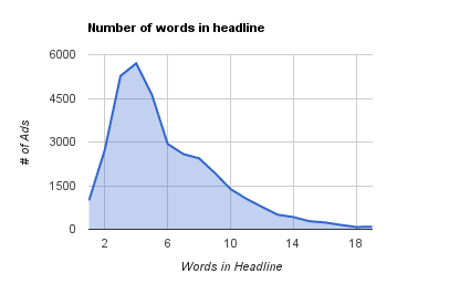
The ideal length varies depending on the type of content. According to Adspresso, the perfect length of a Facebook ad headline is just 5 words.
A short headline is a more effective call to action and looks better. Facebook also cuts off overly long headlines. A study on more than 37,000 Facebook Ads yielded the following results:
2. Use lists in copy and headline
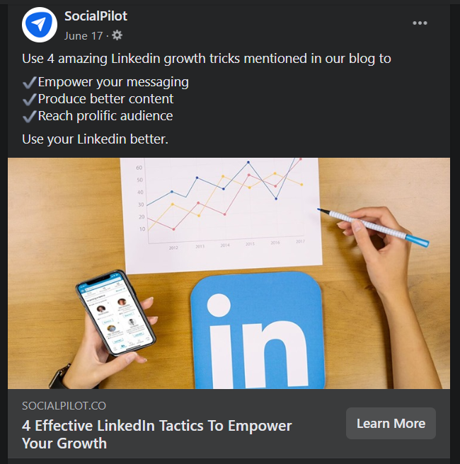
Buzzfeed, as you might already know, is the champion of lists. The quest for quick-to-consume, scannable content drives your Facebook audience to check out list posts.
Pro-tip: Save your audience’s time by always including a teaser. For example, give away six tips when you share a link to a blog post with 14 tips. This way, the audience can make a fast decision whether the link is one they want to click. If they want to know more about the teaser content, they can click through and keep reading.
3. Make it fun & interactive with emojis
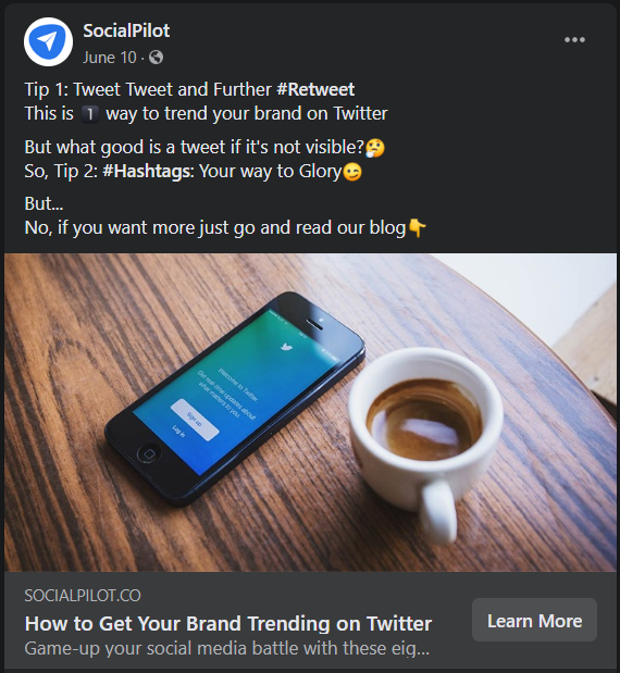
Adding emojis in your post can increase comments and shares by 33% and likes by 57%. Emojis, when used properly, are a language in their own. Here’s a guide to help you use emojis across all social platforms.
4. Use the ideal sizes recommended for Facebook
Here are the ideal sizes for images:
- For image posts: 1,200 x 628 pixels
- For posts with image links: 1,200 x 628 pixels
- For Stories: 1,080 x 1,920 pixels
For sharing links with images:
- Square Photo (in feed): 154 x 154 pixels (minimum)
- Square Photo (on Pages): 116 x 116 pixels (minimum)
- Rectangular Photo (in feed): 470 x 246 pixels (minimum)
- Rectangular Photo (on Pages): 484 x 252 pixels (minimum)
5. Experiment with a variety of media formats
Ideally, you’d mix images with blog links, video content, GIFs, and other formats that are relevant to your business.
Focus on native videos. A recent study by quintly showed native Facebook videos got a 186% higher engagement rate and 503% more comments.
You can also use Facebook management tool to to easily drive multiple Facebook profiles with variety of content flow.
You can also use the Facebook management tool to easily drive multiple Facebook profiles with a variety of content flows.
In terms of video content, it’s best to find a length that works for your brand. When in doubt, stick with shorter videos, under a minute in the best case.
Your videos should be educational and informative because you’re competing for attention with thousands of other brands.
How to Craft an Engaging Post for Twitter
Like I said earlier, most people come to Twitter to get ‘updates’, whether it’s news or new blog posts.
Hence, it’s important that your post creates a sense of urgency – why should they pay attention to it right now? It helps to tell your audience that you are posting ‘new’ content.
1. Don’t use up all 280 characters
A study by Buddy Media showed that Tweets with 100 characters got 17% higher engagement rates than longer ones.
It can be a challenge to get your Tweets down to under 100 characters, but it’s a challenge worth taking on because you’ll eventually come up with powerful, concise posts.
Being clear and succinct is crucial because this platform moves at lightning speed. Sometimes, there are just seconds to grab an audience’s attention.
2. Don’t overdo the hashtags
I know you’ve been advised to use as many hashtags as possible – they ensure people find your tweets when they’re searching for all those hashtags.
However, using a lot of them, especially irrelevant ones, can cause people to just keep scrolling down their feed.
Don’t use more than two to three hashtags, you should know when and how to use these hashtags properly.
3. Use GIFs
GIFs add life to your tweets and increase your engagement. GIFs also take the ‘show, don’t tell’ idea a step further.
You can use GIFs for almost everything – inspirational quotes, funny reactions, slideshows, informative content, etc.
Think about it, wouldn’t you stop scrolling down your feed to see an image with repetitive action?
4. Use the ideal sizes recommended for Twitter
- Square image recommended: 440 x 220 pixels
- Include a maximum of 4 images at one time
- Maximum file size of 5 MB for photos, 5 MB for animated GIFs on mobile, and 15 MB on the web
5. Mention Others in your Tweets
It’s the smartest trick in the book. Mention people in your tweets and they (along with their followers) will be tempted to engage with it.
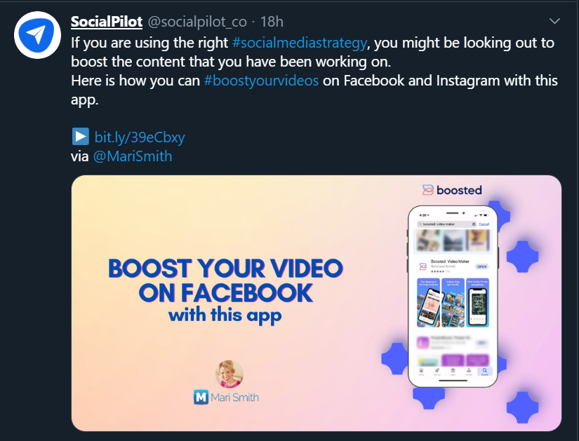
These are just a few examples of how you can mention people in your tweets:
- Share content put out by influencers, attribute it to them and also mention what you liked about the content.
- Mention experts and ask for their opinion regarding a topic/event/news
- Mention your top fans to grab their and their followers’ attention
- Mention employees while talking about an office event
To keep all this in check and maintain consistency using the best Twitter automation tools is advisable.
How to Craft an Engaging Post for LinkedIn
If you scroll through your LinkedIn feed right now, you’ll most probably see long text posts, videos and link posts with images.
That’s just it – all the winning LinkedIn posts. As opposed to Facebook and Twitter, your LinkedIn audience loves long posts.
The first two to three lines of your post must generate enough interest for the reader to click ‘see more’.
Pro-tip: End your posts with questions. In LinkedIn posts, questions work like CTAs – they encourage people to act. In this case, people act by replying to you in the comments.
1. The title must be new, unique, specific
The title is the most important part of the content on LinkedIn. Generally, a good title will contain the following:
- Something specific to a particular target group of readers
- Something new and unique
- A sense that reading the article NOW is important
- A direct benefit people will get from reading the article
A great title is particularly important to reach people who don’t know you. When creating LinkedIn content, always ask yourself if you have created curiosity or a sense of benefit.
There is a limited likelihood of people seeing a point in clicking and reading the post if its title is a generic question or a bland general statement.
A study conducted by Paul Shapiro in 2014 on the 3,000 most successful posts in the history of LinkedIn found a surprising common denominator: The most popular posts were written in such simple English that even a small child could understand them. Hence, ensure that your headlines and post copy don’t have any jargon.
Tip You can make use of a free LinkedIn scheduling tool to help you promote these long-form posts effectively.
2. Number of LinkedIn images – ideally between 4 and 8
Although preferences can vary from person to person, research shows the most successful posts on LinkedIn contain between four and eight pictures. What is more, the pictures are ordered into clear sections, each of which tackles specific topics or points.
In every event, you need at least one image. Make sure the image or one of your images is at the top of the post.
3. Use the ideal sizes recommended for LinkedIn
- Recommended size for images or links: 1200 x 628 pixels
- Maximum size for shared images: 1104 x 736
- Image files: JPNG, JPG or GIF
Crafting & Scheduling Engaging Posts with SocialPilot
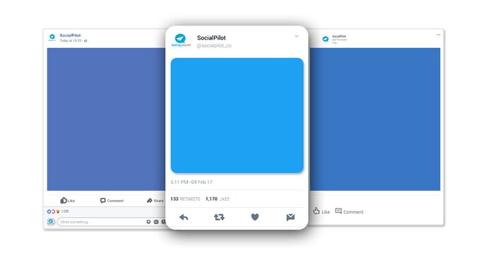
Understanding your needs for customizing posts for different platforms, SocialPilot helps you compose, edit, and schedule customized posts for Facebook, Twitter, LinkedIn, and more.
Using this feature, you can craft three different posts within one compose box.
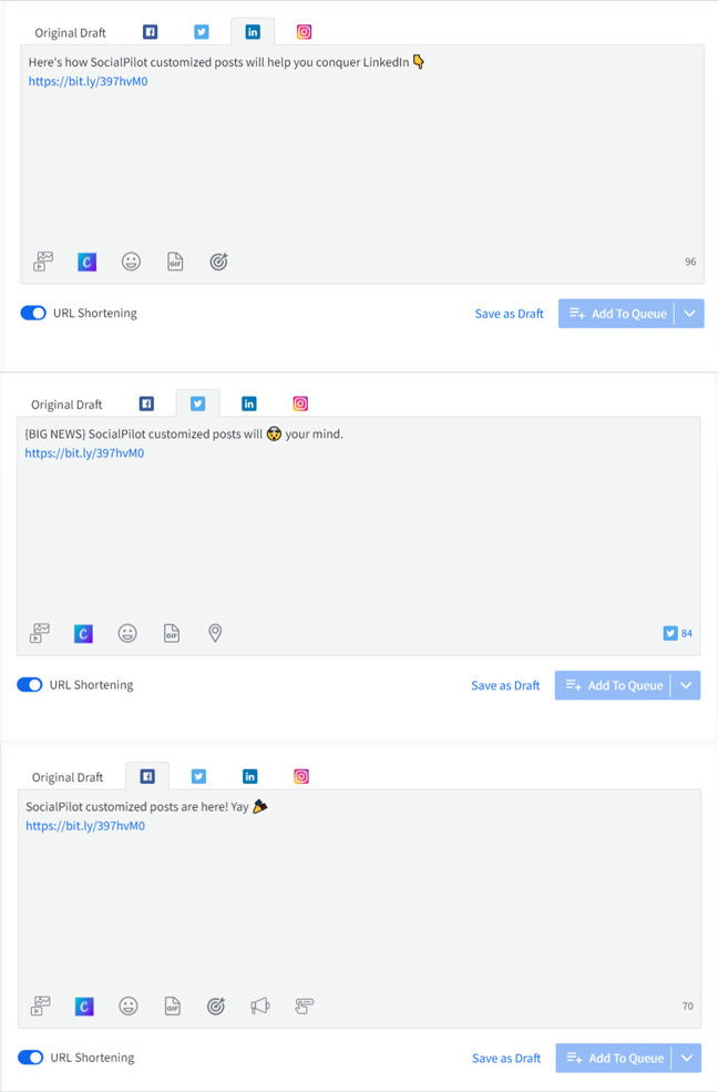
Along with the captions, you can also take care of the different image sizes that each social channel requires by switching the tabs and adding images separately.
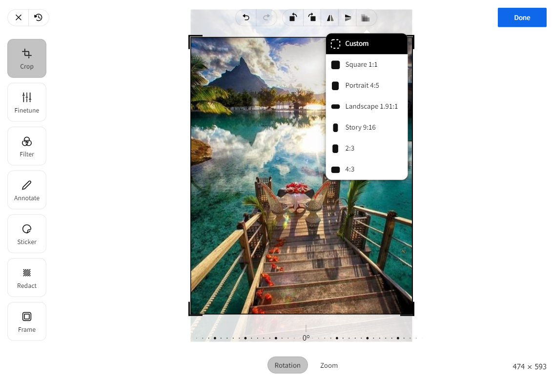
Do you often post wrong-sized images on social channels that get stretched, cropped, or rejected? Use SocialPilot’s inbuilt image editor to fix your images instantly and never post a wrong-sized image.
In one click, resize your image post in the square(1:1), portrait(4:5), and story(16:9) aspect ratio for Instagram. Similarly, publish pixel-perfect images with the landscape (1.91:1) and vertical (2:3) predefined aspect ratios for other social media platforms.
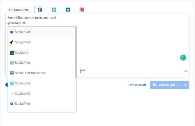
Like I said before, mentioning others can help you get more eyes on your posts. SocialPilot enables you to mention profiles and Pages in your Twitter and Facebook posts, respectively.
Just start typing a name with @ and you’ll be shown a couple of suggestions from which you can select anyone.
SocialPilot also helps you schedule multiple images in the form of carousel posts for Facebook, LinkedIn, and Instagram.
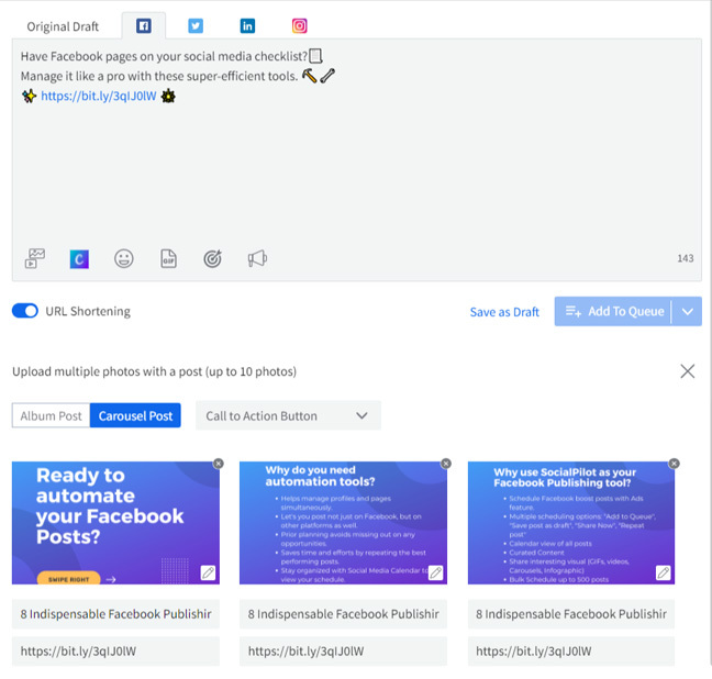
Carousel posts are great ways to tell a story with multiple images. Every image has a description and a target URL. You can use this format to:
- Describe the functions of a product in steps
- Mentions features of a product
- Provide short pieces of information like tips
I hope these features help you create unique posts for Facebook, Twitter, and LinkedIn keeping in mind every platform’s audience, ideal image sizes, ideal post length, engagement trends, etc

