![23 Simple Email Marketing Tips to Improve Your Open and Clickthrough Rates [+HubSpot Blog Data]](https://www.liveseo.com/wp-content/uploads/2022/03/23-Simple-Email-Marketing-Tips-to-Improve-Your-Open-and.jpgkeepProtocol.jpeg)
Practicing good inbound marketing means sending emails to people who actually want to hear from you.
But oftentimes, your emails still end up getting lost in your customers’ inbox clutter — or worse, their spam folder. And then, when someone actually opens your email, they don’t actually click through.
You might think to yourself, “Ugh, I just can’t win.”
Don’t worry, I’ve got your back. Here are 23 tips that are perfect for small and growing businesses, but anyone can embrace right now to improve their emails’ open rates, clickthrough rates, and lead generation potential.
Email Marketing Tips for Small Businesses
- Do not buy email addresses.
- Abide by CAN-SPAM rules.
- Ensure your opt-in process complies with GDPR.
- Email new contacts within 24 hours.
- Send your emails from a real person, not your company.
- Pre-set the preview text.
- Write clear and clickable subject lines.
- Keep your emails concise.
- Include one call-to-action button per email.
- Add alt text to your CTA image.
- Hyperlink your emails’ images.
- Include noticeable text links.
- Place at least one clickable item above the fold.
- Add alt text to all of your images.
- Avoid background images.
- Add social sharing buttons.
- Simplify sharing with ready-made tweets.
- Add an email forwarding option.
- Clean up the plain text version of your emails.
- Optimize your emails for mobile users.
- Preview and test your emails before sending them.
- Don’t be afraid to ‘clean up’ your contact list.
- Monitor each email’s performance.
1. Do not buy email addresses.
I know what you’re thinking: In the early stages of an email marketing newsletter, you want to do whatever it takes to kickstart the campaign and get eyeballs on your business. I get it. Whatever options you see online, however, you should resist the urge to purchase an email list.
There are lots of ways to buy an email list, but none of them will actually benefit your campaign. Why? Since the owners of these email addresses didn’t explicitly agree to receive content from you, there’s no telling how interested they are — or if they’re even a fit for what you have to offer. A bought email list is also in violation of GDPR (we’ll talk more about this in just a minute).
Purchasing email lists is always a bad idea. Get more reasons why in this blog post.
2. Abide by CAN-SPAM rules.
CAN-SPAM (Controlling the Assault of Non-Solicited Pornography And Marketing) is an act that was passed in 2003. Essentially, it’s a law that establishes the rules for commercial email and commercial messages, gives recipients the right to have a business stop emailing them, and outlines the penalties incurred for those who violate the law.
In order to be CAN-SPAM compliant, it’s important that your email messages follow these rules, which are available on the FTC’s website.
A few highlights:
- Include your valid physical postal address in every email you send out.
- Give recipients a clear and obvious way to opt out (i.e., unsubscribe) of every email you send. (HubSpot customers: Don’t worry — you can’t save an email template unless it includes this element.)
- Use clear “From,” “To,” and “Reply to” language that accurately reflects who you are.
- Avoid “no-reply” or similar sender names, which prevent recipients from opting out of an email newsletter if they’d like to.
- Avoid selling or transferring any email addresses to another list.
Note: Because I am not a lawyer, please do not construe the contents of this article as official legal advice. Check out the FTC’s website for extensive advice on this subject, and read this blog post for more tips on improving email deliverability.
3. Ensure your opt-in process complies with GDPR.
You’ve probably heard of the General Data Protection Regulation (GDPR), a new law enacted across Europe in May 2018 to better protect internet users’ personal data.
We don’t expect you to have this long piece of legislation memorized. However, if some of your email recipients live in Europe, there is one key guideline by which you should develop your email marketing campaigns:
When your website users land on a page that solicits their personal information, tradition might tell you to include a pre-checked box that opts the user into an email campaign so they can receive updates and special offers related to your business. Today, having this box pre-checked is in violation of GDPR. So, to comply with GDPR, make sure your European users and customers are given the clear option to opt into your email newsletter themselves — don’t make the decision for them.
This rule might sound like bad news for your email marketing campaign, but it can actually improve your open and clickthrough rates. Limiting your subscriber list to just those who specifically asked to join you will ensure only the most interested people are receiving your messages. This maximizes the chances that you’ll convert readers to qualified leads as a result of an email send.
4. Email new contacts within 24 hours.
It’s important to take advantage of the window of opportunity when your company or brand is at the top of your prospects’ minds. You can really get a pulse of what future engagement will look like by what people do when you email then within 24 hours of their subscribing to your newsletter, signing up for an offer, and so on. Plus, it’s a great opportunity for branding and setting expectations.
If you don’t have any automated email workflows set up, you’re likely missing out on some major opportunities to nurture and engage your existing contacts.
(HubSpot customers: Use HubSpot’s Workflows App to create personalized, automated email workflows that can get triggered in a number of different ways: when a contact gets added to a list, submits a form on your website, clicks a link in an email, views a page on your blog, clicks on one of your AdWords ads, or becomes a marketing qualified lead.)
5. Send your emails from a real person, not your company.
When you send email from a real person, your email open rate increases. Plain and simple. This is because — based on past tests we’ve conducted — recipients are typically more likely to trust a personalized sender name and email address than a generic one. People are so inundated with spam nowadays, they often hesitate to open email from unfamiliar senders — and they’re more likely to trust a personalized sender name and email address than a generic one.
At HubSpot, we found that that emails sent from “Maggie Georgieva, HubSpot” perform better in terms of open and clickthrough rate than emails sent from just “HubSpot.” So, it may be best to do this …
… instead of this:
(HubSpot customers: Click here to learn how to personalize the “From” name and email address.)
Note: Our tests showed personalization works, but we’ve also found that a combination of a person’s name and a company name together in the sender name works well, too. You’ve just got to A/B test what works best for your particular company, brand, and industry as well as what’s ideal based on to whom you’re sending emails.
6. Pre-set the preview text.
Email clients like the iPhone Mail app, Gmail, and Outlook will display the first few lines of text from the body of your email alongside the subject line. In other words, it’s a text preview of the content inside the email. The exact amount of text shown depends on the email client and user settings.
Use it to provide a short, to-the-point synopsis of what you’re offering — and keep it to 50 characters or less.

When you don’t set the preview text, the client will automatically pull from the body of your email, which not only looks messy, but is also a wasted opportunity to engage your audience. (HubSpot customers: Click here to learn how to set the preview text of your emails.)
7. Write clear and clickable subject lines.
Speaking of the subject line … your marketing emails have a lot to compete with in recipients’ inboxes. The best way to stand out is to write compelling, “can’t-help-but-click-on-this” subject lines.
To entice readers to click, be sure your subject lines:
- Are super clear and understandable.
- Are fewer than 50 characters so they don’t get cut off, particularly by mobile devices.
- Use language and messaging that your target buyer persona is familiar with and excited about.
- Include verbs and action-oriented language to create a sense of urgency and excitement.
- Include an exclusive value proposition (like 20% off an item or a free ebook) so people know what they’re getting.
- Avoid spam triggers like “Cash,” “Quote,” and “Save.”
- Are timely, if applicable. (One of my favorite subject lines came from Warby Parker and read: “Uh-oh, your prescription is expiring”.)
- Include their first names sometimes (it could increase clickthrough rates), or even add something about their specific location. (You’ll want to do this sparingly, like for your most important offers, rather than over-doing it and being repetitive or intrusive.)
Read this blog post for more tips on writing clickable, delightful subject lines.
8. Keep your emails concise.
Everyone’s busy and their inbox is already full. Why add to the problem with a longwinded email? People generally like short, concise emails better than long ones because concise emails have an obvious focus. Plus, when your users are scanning through all their emails in a short amount of time, they’re more likely to find the overall message before deciding to take any action.
Another reason to keep your emails short? Too much copy is actually a red flag for spam filters, too.
To keep your emails short and compelling, write your email like you were talking to someone in real life. If your email has to be on the long side, break it up into multiple paragraphs to provide visual breaks. This’ll make skimming it much easier on your reader. (Read this blog post on how to write compelling emails for more tips.)
Here’s a great example of a concise email:

9. Include one call-to-action button per email.
Remember when I said a lot of your email recipients will scan your email without reading all the copy? That’s why you want to have a clear call-to-action (CTA) button that’s easy to spot for even the quickest of email scanners. Without a CTA button, you won’t be calling on your recipients to take any action that actually benefits them — and the growth of your business.
You’ll want to place your CTA in a location where it’s easily visible and where it makes sense for someone to click on it. For example, you might put a CTA to download a free ebook in an email that describes new strategies for using your product.
Once you’ve determined where you want to put your CTA, it’s time to create the button itself. Click here to download 50 free CTA button templates to get you started. (HubSpot customers: Learn how to add CTA buttons to emails in HubSpot here.)
10. Add alt text to your CTA image.
Many email clients block images — including your CTA buttons — by default. That means a good chunk of your audience may not see your beautiful, optimized CTA. Instead, they see this:

When you set an image’s alt text, though, you let recipients who can’t view images in their email know exactly where to click to complete the action:

You can either edit the alt text in your email tool’s rich text editor (just right-click the image and edit away), or you can manually enter it in the HTML editor of your email tool like this:
<a href=”HTTP://YOURLINKHERE.COM“><img class=”alignCenter shadow” src=”YOUR CTA BUTTON IMAGE SOURCE HERE.JPG” alt-text=”YOUR ALT-TEXT GOES HERE“/></a>
11. Hyperlink your emails’ images.
Your ultimate goal in email marketing is to get people to click through to a web page. One way to increase the clickthrough rate without littering the copy with links is to hyperlink the images in your email to the webpage that corresponds with the content of the image.
If you’re inviting readers to download an ebook, for example, and you have a picture of the ebook included in the email, don’t just hyperlink the text next to the image telling people to “download it here.” Hyperlink the ebook’s picture, too. People are drawn to images much more commonly than text, and you want to give your email subscribers as many options to get your ebook as you can.
You can simply click on the image and then use your email tool’s “Insert/Edit Link” option, or you can link an image in the HTML editor using the following code:
<a href=”HTTP://YOURLINKHERE.COM“><img class=”alignCenter shadow” src=”YOUR IMAGE SOURCE HERE.JPG“/></a>
12. Include noticeable text links.
In general, it’s a good idea to link to your featured offer in multiple places in addition to the clear and focused call-to-action button. In addition to your main CTAs and images, consider including a noticeable text link (or two) when applicable, as having more links increases the opportunity for engagement.
13. Place at least one clickable item above the fold.
One way to make your emails more clickable? Place one or more of your clickable elements — whether it’s a CTA button, a text link, or a clickable image — near the beginning of your email.
This is especially useful for mobile users. Mobile tends to require a lot of scrolling, and sometimes squinting, pinching, and zooming. Giving a recipient something actionable that is seen upon opening can lead to more clicks in this environment.
14. Add alt text to all of your images.
Again, a lot of email clients out there block images by default. (Here’s the full list from Campaign Monitor.) In those cases, images won’t load unless the recipient clicks a button to show them or change their default settings.
Adding alt text to your email images helps recipients understand your message — even if they can’t see the images right away. (HubSpot customers: Click here to learn how to add alt text to your email images in HubSpot.)
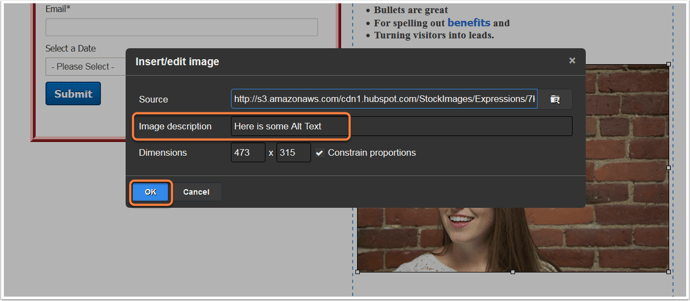
You might consider making the language in your alt text actionable, such as “Click here to download the ultimate content creation kit.” Actionable alt text will essentially turn every linked image into another CTA. So, even if someone doesn’t see the snazzy GIF of my latest offer (or if they hover their mouse over an image that does show up), the alt text will beckon them to click.
15. Avoid background images.
This is especially important if your target buyers tend to use Outlook as an email client.
Microsoft Outlook doesn’t recognize background images, period. Given that Outlook is the fifth most-used email client with 7% of the market share — and that’s in total; your industry might have a lot more — it’s best to avoid using background images altogether.
Instead, use a background color and use images in other ways in your email, like Harry’s did in their email below:
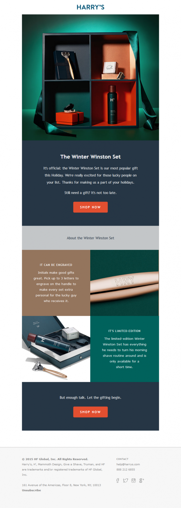
Image Credit: Beautiful Email Newsletters
16. Add social sharing buttons.
Increasing the number of people who see your link will increase the number of people who click on it. So, be sure to extend the life of your email by adding social sharing buttons.
Many email tools will come with templates that have built-in social sharing buttons that make it easy — just fill in the destination URL and you’re good to go. If you don’t have built-in capabilities, here is a cheat sheet for easily creating your own social sharing buttons.
Important Note: If you want to increase clicks, you want to add sharing buttons, not follow buttons. The former will allow your email recipients to pass along the offer URL in your email to their followers. The latter will prompt them to Like, follow, or add your company social media channels.
17. Simplify sharing with ready-made tweets.
People are far more likely to take an action if you make it really, really easy for them. For recipients out there who are too lazy to tweet the wonderful content you sent them via email, you can make it easy for them by creating what we call a “lazy tweet.”
One simple way to do this? Using ClickToTweet, a free custom tweet link generator. First, go to ClickToTweet’s basic tweet generator. Then, type in your tweet, desired (trackable) destination URL, and hashtags:

Click “Generate New Link,” and then grab that link. Then you can link it to your Twitter sharing button. Or, if you’re segmenting your list by attributes such as “has Twitter” or “topic of recent conversion: social media” (you’ll need marketing intelligence software like HubSpot for this), you can even include it in your main email copy, like this:
18. Add an email forwarding option.
Another way to extend the clicks on your email beyond its shelf life is to prompt your audience to forward the offer. The folks at Litmus found that the most forwarded emails were 13X more likely than the typical email to include “Share With Your Network” calls-to-action. By including forward-to-a-friend (or social sharing links, as we discussed above), you put it in recipients’ minds to share.
You can add a little post-script to the end of your email copy, such as “Not responsible for your company’s social media? Feel free to forward this ebook to a friend or colleague using social media marketing.” Link the call-to-action to a pre-made email, complete with subject and body text. That way, all someone has to do is enter their associates’ email addresses and hit “Send.”
You can highlight text or an image and add the URL via your email tool’s rich text editor and then enter a mailto:? link. Here’s what this looks like:
You can also create this in your HTML editor. Here’s how to attach a mailto:? link to text:
And here’s how to attach your mailto:? link to an image, such as a sleek call-to-action button that says “Email This Offer”:
Just make sure you use the “%20” tag to separate words! Otherwise, your message willreadlikethis (not too appealing, right?).
19. Clean up the plain-text version of your emails.
Not every recipient is going to see the beautiful, HTML, rich-text version of your email. Some clients don’t support HTML-rich emails, while other times, a person may simply choose to only view messages in plain text.
When you don’t optimize the plain-text version of your email, this is what happens when someone views it:
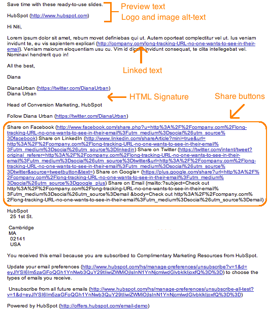
Scary, isn’t it? I don’t think many people are going to bother to read through this garbled mess.
So, cut out the extra text, replace long tracking URLs with shortened ones, and keep the body simple. Taking the five extra minutes to optimize your email’s plain-text version could help you reach more of your target segment and keep you out of the spam folder.
Note: When you’re cleaning up your plain-text emails, don’t change the actual copy much at all or you’ll risk it getting marked as spam.
20. Optimize your emails for mobile users.
In Litmus’ analysis of over a billion email opens, they reported that 56% of opened emails were opened on mobile devices in April 2016. This figure represents an 8% increase in mobile opens in the past year.
“This represents a peak for mobile market share,” they wrote, “and the longest sustained growth we’ve seen after the holiday season.”
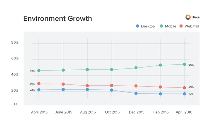
Image Credit: Litmus
As more and more people use their mobile devices to read email and surf the web, it’s more important than ever that marketers design their emails with mobile users in mind. Otherwise, their user base will be significantly affected.
How? Here’s a visual example of what happens when images aren’t optimized for mobile (first) versus when images are optimized for mobile (second):
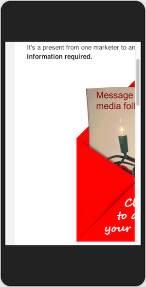
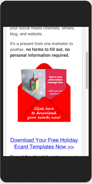
Isn’t the second image a much better user experience?
Here are a few ways to optimize your emails for mobile devices:
- Reduce your images’ file sizes to make up for mobile devices’ generally slower download speeds. (HubSpot customers don’t need to worry about it — images uploaded to HubSpot’s software are automatically compressed. Otherwise, tools like TinyPNG will help you reduce file size.)
- Ensure the CTA buttons and links are larger than 45-57 pixels for the best user experience. Why? According to an MIT study, the average size of an adult index finger is 1.6-2 cm, which translates to 45-57 pixels on a mobile device.
- Invest in responsive email templates. Creating your own responsive template may be beyond your particular skill set or bandwidth. Sometimes, the most economical solution is to just license or buy email templates from the people who do it best.
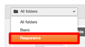
HubSpot customers: HubSpot’s default email templates are all optimized for mobile using responsive design. To access these templates, create a new email and look for the responsive option in the “folders” drop-down in the top left.
21. Preview and test your emails before sending them.
When you’re finally ready to hit “Send” on your email, make a habit of double-checking one last time whether your emails look as good as you think they do. If your email marketing tool lets you, go ahead and preview what your email looks like in different email clients and devices that are popular with your audience.
(HubSpot customers: You can preview what your emails look like in 30+ email clients right in the HubSpot Email App, as well as preview what your emails will look like on any device — including desktop, tablet, or mobile devices. Click here to learn how.)
You should also send out a test version of your email before you send out the real deal to ensure it’s working properly for everyone on your email list. Start incorporating these as final steps in your email review process. (HubSpot customers: Learn how to test your emails here.)
22. Don’t be afraid to ‘clean up’ your contact list.
It’s tempting to keep every subscriber you win on an email campaign until they personally choose to opt out. But just because they haven’t opted out of an email newsletter doesn’t mean they’re still interested, and subscribers who have become inactive can kill your emails’ open and clickthrough rates.
To make sure you’re only sending emails to the people who want to read them, clean up your email list so that it excludes recipients who haven’t opened a certain amount of emails in the campaign’s recent history. This makes sure your emails’ open and clickthrough rates reflect only your most interested readers, allowing you to collect more effective data on what is and isn’t working in each email you send.
On top of that, a good email list cleaning service removes other email addresses that pose a risk to your inbox placement. “Invalid, abuse, and temporary emails will affect your sender reputation, so it’s best to weed them out,” says Liviu Tanase, CEO of ZeroBounce. “Your desire to grow your list is only natural, but you can’t afford to expand it at all costs. Emailing only valid and active addresses allows you to connect with people who care about your brand, and that’s what every email marketer wants,” Tanase adds.
(HubSpot customers: Lists that add and remove members based on their email behavior are called smart or “active” lists. Learn how to create them in HubSpot Academy.)
23. Monitor each email’s performance.
What’s working in your email campaign this month might not work quite as well next month, and it’s imperative that you check in on your emails’ open and clickthrough rates for opportunities to improve your copy (to do this, of course, you’ll need a tool to track your email analytics).
If after a month of email sends, for instance, you find 10 messages are getting double the engagement as the other 20, analyze them. What did you do differently in the higher performers? Was it the imagery? The subject line? Maybe you have more than one audience segment and one of them just isn’t as interested in your current email content.
Use your email performance data to run A/B tests that are designed to show you what your email recipients really want out of your newsletters, and steer into the trends that you see to make your email campaigns more desirable.
Email marketing can be tough at times — I’m right there with you. But by sending compelling offers to the right target segments and paying attention to the little details that go into an email, you can increase the opens clicks in your emails and generate more leads. (And learn more about which email marketing metrics to track — and how — here.)


![HubSpot's 2025 State of Blogging Report [Data from 500+ Marketers]](https://www.liveseo.com/wp-content/uploads/2025/02/HubSpots-2025-State-of-Blogging-Report-Data-from-500-Marketers.webp-300x300.webp)
